Examples
This section demonstrates various use cases of the pysampled package with visual examples. Each example showcases a specific functionality, and includes plots generated directly from the code. In the plots, the x-axis represents time (in seconds).
1 - One-liner
The following example computes the magnitude of a 3-axis accelerometer signal, thresholds the signal, and vidualizes the first two seconds of the result.
(sampled.generate_signal("accelerometer").magnitude() > 1.4)[:2.].plot()
Plot Output:

2 - Compute and Visualize Accelerometer Magnitude
A different implementation of example 1.
acc = sampled.generate_signal("accelerometer")[2.5:6.] # 2.5 to 6 s
ax = sampled.plot([acc.magnitude(), acc.magnitude() > 1.4])
Plot Output:

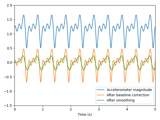
Example 3 - Magnitude Calculation with Smoothing
In this example, we compute the magnitude, remove the DC offset, and apply a moving average filter.
acc = sampled.generate_signal("accelerometer")
sampled.plot([
    acc.magnitude(),
    acc.magnitude().shift_baseline(),
    acc.magnitude().shift_baseline().smooth(0.16)
])
Plot Output:
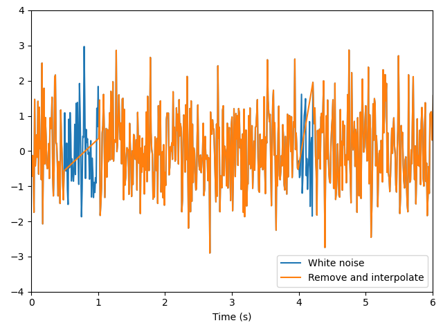
Example 4 - Removing Noise and Interpolating
This example generates white noise data, removes data in specified ranges, and interpolates the result.
wn = sampled.generate_signal("white_noise")
sampled.plot([
    wn,
    wn.remove_and_interpolate([[0.5, 1], [4, 4.2]])
])
Plot Output:
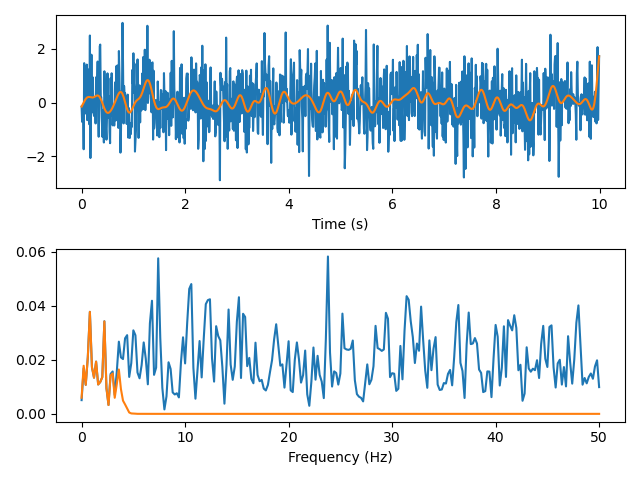
Example 5 - Visualizing the Power spectral density
In this example, we generate white noise data, apply a low-pass filter, and visualize both signals in the frequency domain.
import matplotlib.pyplot as plt
wn = sampled.generate_signal("white_noise")
wn_lowpass = wn.lowpass(4)

figure, (ax1, ax2) = plt.subplots(2, 1)
sampled.plot([wn, wn_lowpass], ax=ax1)
ax1.set_xlabel("Time (s)")

sampled.plot([wn.psd_as_sampled(), wn_lowpass.psd_as_sampled()], ax=ax2)
ax2.set_xlabel("Frequency (Hz)")
figure.tight_layout()
plt.draw()
Plot Output: